Apr 16, 2026
How 59 User Tests in a Single Day Proved Wordless Search Works
Last year, I stood in the middle of a bustling tech conference, personally conducting 36 tests in one day. It was hands-on, chaotic, and exhausting, but incredibly insightful. If you haven’t read that story yet, you can find it here. This year, I wanted to outdo myself. Not by running more tests in the same way, but by designing a smarter, more scalable experiment that didn’t require me to be there in person. The result? 59 tests in a single day.
This wasn’t just about the numbers. It was about understanding how users actually behave and interact with Wordless Search, and finding actionable insights that could shape how your customers shop tomorrow.
The Setup
It all started with a single question: “How would users interact with Wordless Search?” To find out, I designed an experiment with three key elements:
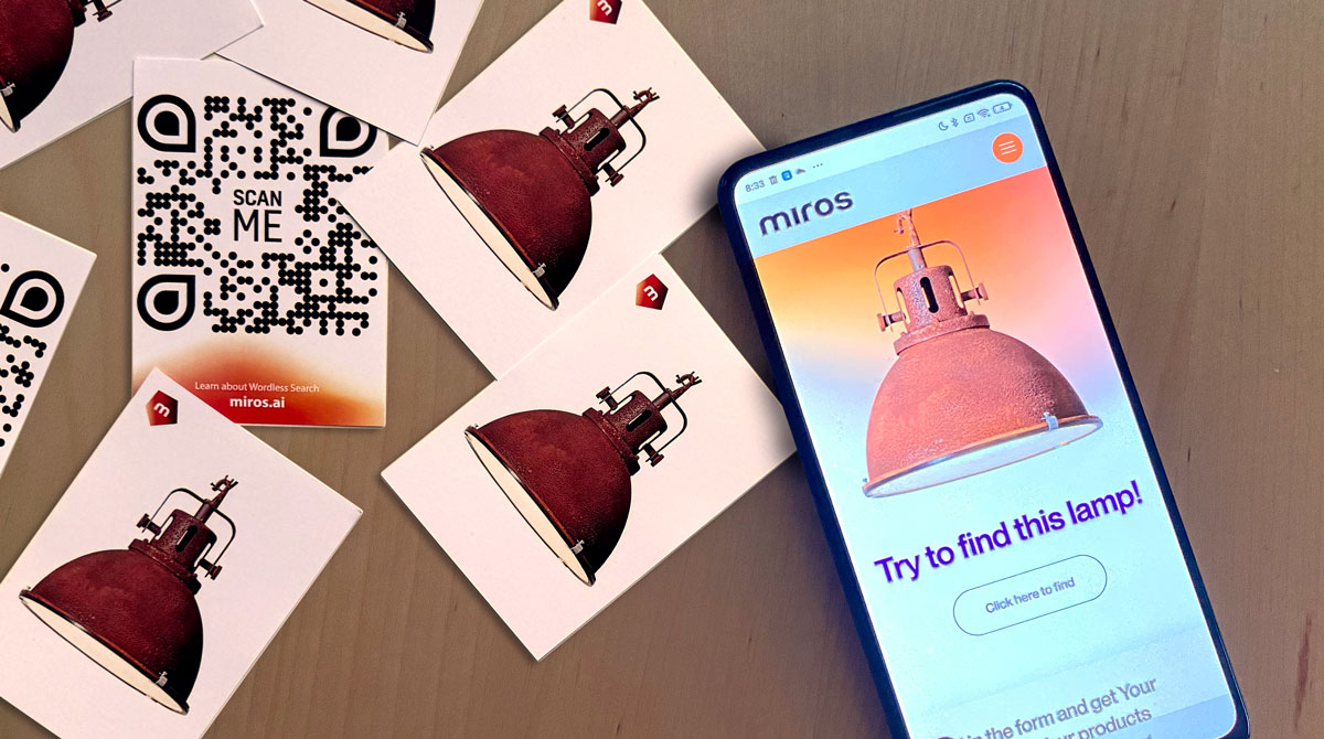
- QR Cards: Each card showed a product image and a QR code that took users to a landing page.
- Landing Page: Clean and focused. The challenge was clear: find this exact lamp.
- Tracking: Every interaction—click, scroll, and search—was recorded, giving me rich behavioral data to analyze.
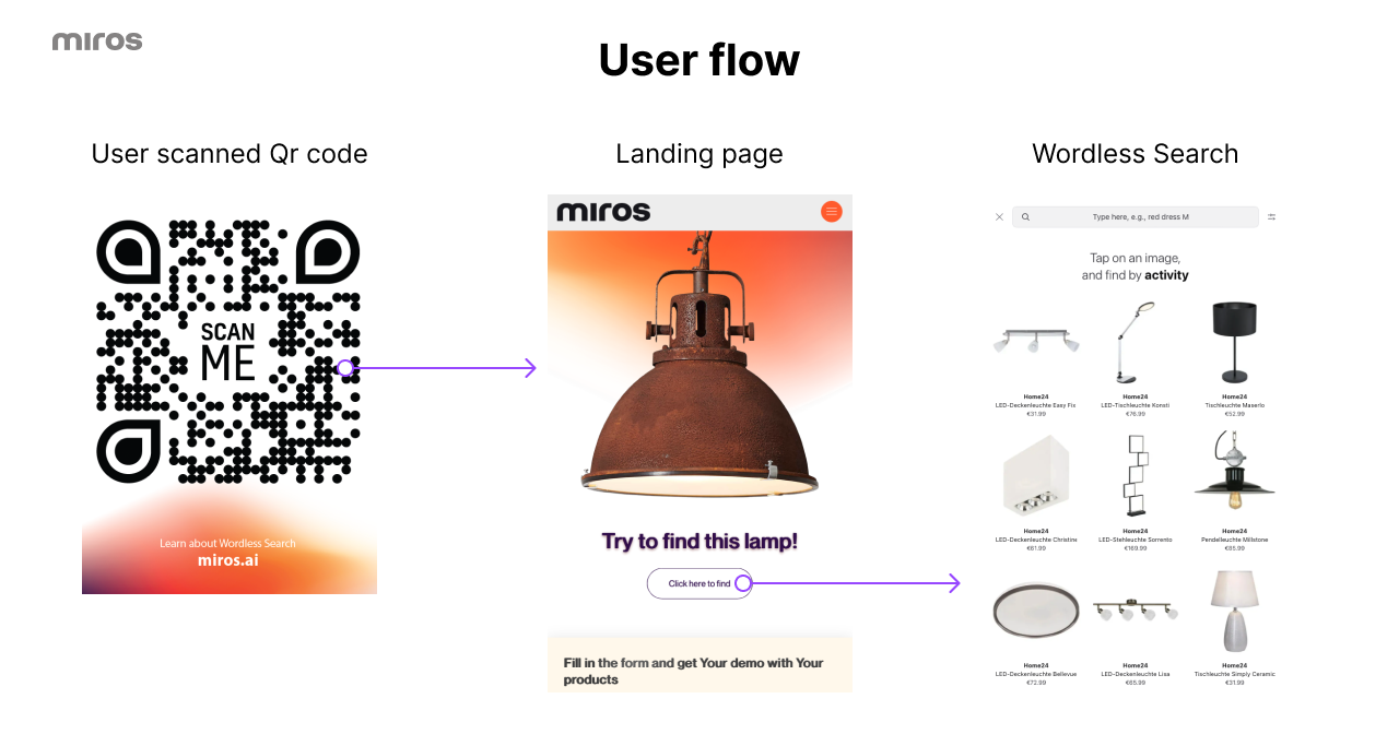
I handed over the QR cards to our team at the event. Once the QR cards were handed out, it was up to the users to take on the challenge. The task was straightforward: scan a QR code, land on a page, and find that exact lamp using the Wordless Search.
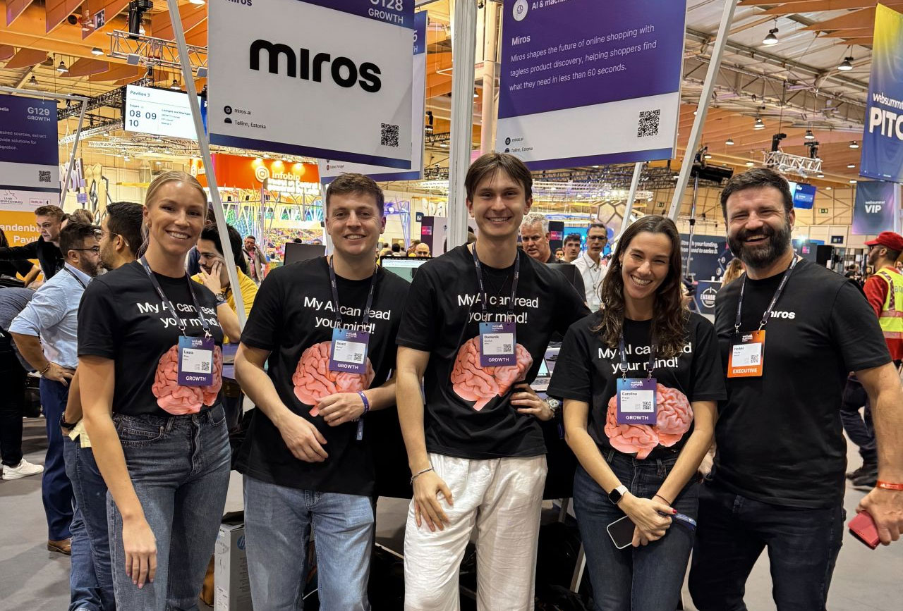
Our team at Web Summit 2024
Participants scanned the card, entered the widget, and began exploring. Meanwhile, every session was tracked, analyzed, and mapped to individual behaviors, giving us a wealth of data on how users interact with a tool designed for modern retail challenges.
Test recording example
What We Learned
Wordless Search drives results
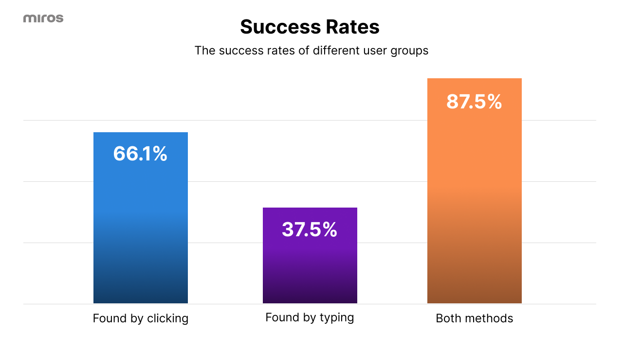
With a 66% success rate, two-thirds of users found the lamp effortlessly. For retail, this reinforces how visual search bridges the gap between user intent and product discovery. Imagine shoppers bypassing clunky filters or irrelevant text searches—they see, click, and explore, finding what they want. It proves that people engage more deeply with tools that feel intuitive and effortless. Wordless Search understands how users think visually, not just verbally.
Visual exploration dominates
Almost every user started by clicking on images, not typing (1 user used type search for first interaction, others clicked on images). This tells me that typing isn’t dead, it’s just not the first instinct when people can explore visually. Users prefer to visually explore when they don’t have the words to describe what they’re looking for.
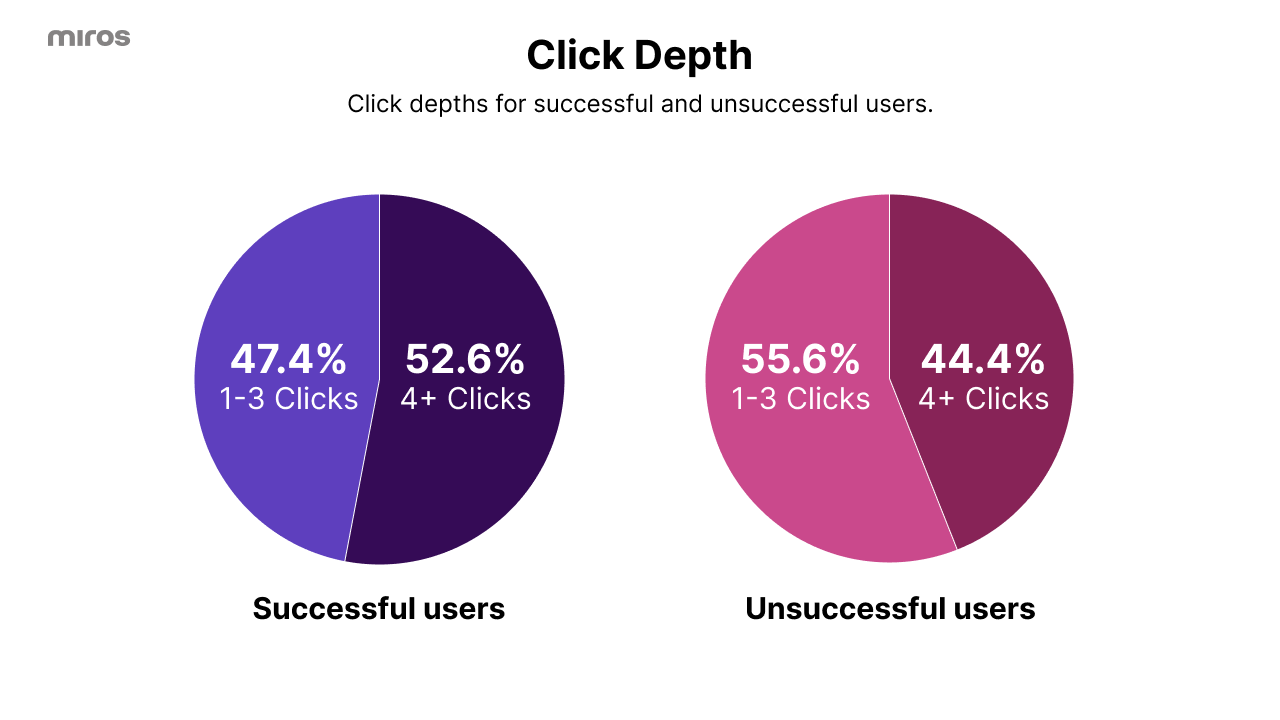
Clicks matter
Among users who succeeded, almost half (47%) found the lamp within three clicks. That’s a win. It shows that when the user sees relevant options early, people find what they need quickly. Most started by clicking on lamps with similar colors or shapes, showing how much visual cues drive decision-making.
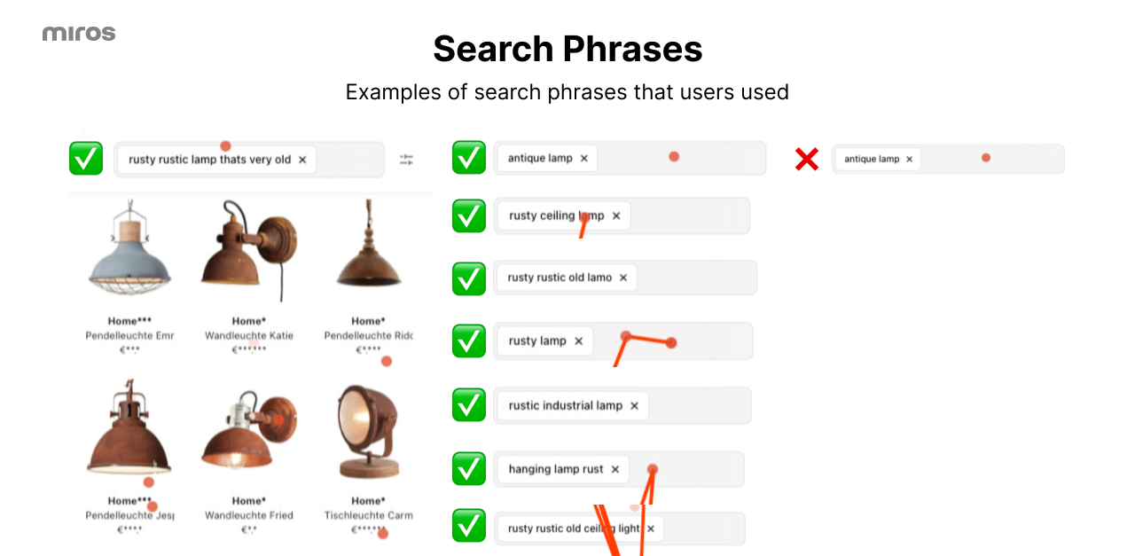
Typing as a backup
- 7% of users switched to typing when they couldn’t find the lamp visually.
- Only 1 user used typing as the first interaction. Everyone else started by clicking.
- Typing proved helpful for some:
- 8 users successfully found the lamp using typing.
- 3 users failed to find the lamp through clicking but succeeded using typing.
- However, 1 user didn’t find the lamp through either method,
- Those who combined clicking and typing were often the most determined. It shows that while clicking was the primary interaction, a solid traditional search fallback is essential.
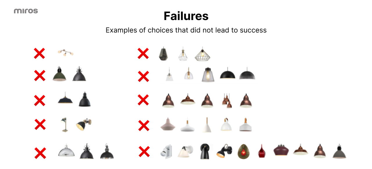
Failures are insights
- 34% didn’t find the lamp, but here’s the breakdown:
- 44% of these users clicked 4+ times before giving up, frustration isn’t the end of the story, it’s feedback.
- Most gave up early when results didn’t meet their expectations. This highlights the importance of diversity in early results.
- For those who didn’t succeed, the average clicks were just under three, which suggests they gave up quickly when they didn’t see what they wanted.
Quiet insights matter
The user who tried clicking and then typed “antique lamp” and still didn’t find the target? It shows where we can improve, whether it’s tweaking the algorithm or refining how results are ranked.
The ones that got away
One user didn’t even open the widget. Two clicked nothing. Did they not understand the task? Were they unsure what to do?
Why This Matters
Traditional search tools often leave shoppers stranded, irrelevant filters, poorly ranked results, or too many choices without direction. Wordless Search changes that. It focuses on how shoppers naturally explore: visually. It’s intuitive, fast, and doesn’t rely on customers knowing the exact terms for what they’re after. The faster a user finds a relevant product, the better their experience and the higher the conversion potential. It’s about creating pathways that feel like exploration but deliver results efficiently.
If you’re managing product discovery for thousands of items or curating thematic collections like “Summer Weddings” or “Office Essentials,” the way users interact with search tools directly impacts their experience. Here’s what these tests showed:
- People love to explore
Shoppers don’t always know what they want, but they know it when they see it. Give users something visual, and they’ll dive right in. Wordless Search taps into that mindset, guiding users with visuals rather than words. It’s a reminder that discovery is as much about curiosity as it is about precision. - First impressions matter
Early results need to be diverse. Showing the same color or style repeatedly frustrates users, especially in fashion where variety sparks inspiration. Retail UX needs to consider how visual options are presented, ensuring there’s enough variety to keep users exploring. - Let users lead
This test reinforced that shoppers want control. They don’t need detailed instructions, they need tools that feel intuitive. - Traditional search as a backup
Typing saved the day for a few users who struggled visually. Offering multiple paths to discovery, like traditional typing alongside visual exploration, ensures no one feels stuck.
A Smarter Way to Test
Last year, I stood at a conference booth and ran 36 tests myself. This year, I didn’t even need to be there. By designing a scalable test with QR cards, a focused landing page, and proper session tracking, I reached nearly twice as many users and captured rich insights.
This year’s experiment wasn’t just bigger than last year, it was smarter. Watching users interact with Wordless Search gave me insights I’d never get in a lab or focus group. And the best part? I didn’t have to be there in person. Real-world testing can happen anywhere, as long as you plan for it.
Next year, who knows? Maybe I’ll hit 100 tests in a day. Or maybe I’ll design a new challenge to push Wordless Search even further. Either way, the goal stays the same: making product discovery easier, faster, and just plain better.
This experiment was a reminder of how people actually shop. They explore, they click, they adapt. And when the tools are right, they find what they want, fast. That’s not just good design; it’s what keeps them coming back.
Curious how it works? Have a go yourself, and discover the magic of Wordless Search.
Missed last year’s story? Read it here.